-
4 Attachment(s)
Barlow Signage - Seeking Community Input on Proposed Signs
I am a member of the Sebastopol Design Review Board (DRB). We've recently reviewed a signage proposal for The Barlow. The proposed signs are fairly large, so will have a lasting impact the character of town. As your representative on matters of design, I would appreciate input as we prepare to make a decision on this matter.
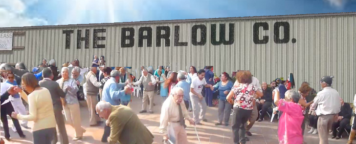
Background - What is proposed are two large, hand painted signs; one on the East and one on the West sides of the Guayaki building.
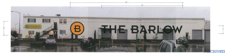
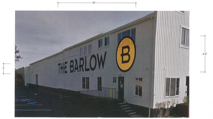
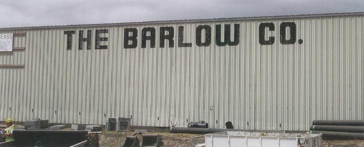
The lettering and the "B" in the circle are proposed to be painted directly on the wall, not unlike the the way original "The Barlow Company" sign was applied to the old building.
My thoughts are as follows:
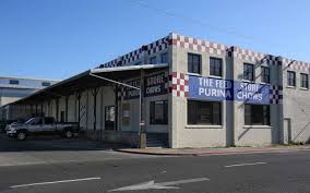
1. History - Large signs on buildings have history here. The old Barlow building (above) and Frizelle Enos (below) are two examples of buildings that have or had large graphics on them, and this way of making a building into a sign is (or was) common in the area. In general, like these types of signs, especially when they work with the building shape like Frizelle does.
2. Disclosure - I am educated as an architect, but practice graphic design and I specialize in signage and graphics in the built environment. I'm a bit biased ... I tend to like well done graphics, even huge ones, but I am also keenly aware of how graphics can affect the character of a place.
3. Nature of The Barlow - I tend to think of The Barlow as a part of Sebastopol rather than a "development" or "project", so I admit to bristling a little at the thought of large Barlow logos in the center of town. We don't have large "Downtown" or "Sebastopol" signs, so I am not sure I like the idea of large scale project or business names. That said, I'm not sure how to reconcile this with my affection for Frizelle Enos. Maybe the Barlow signs will, in time, become something we all feel connected to in a similar way.
4. The Barlow Needs More Visitors (?) - I don't have any hard data, but It's my understanding that some of the tenants in The Barlow are struggling and need more traffic. While I am very sympathetic to this, a development this large always takes time to fill up, establish itself and find it's groove. I'm not sure large scale graphics are going to speed up that natural process, and may have undesirable impacts to the larger community.
5. Sign Exceptions- We have a provision in our code that grants the DRB the authority to allow signs that are outside the limits of the sign code. I take the responsibility of approving the sign exception very seriously. Granting one can be very valuable to a business, so the community should expect a high value visual benefit in return.
Code allows sign exceptions for the following reasons:
1. The exception shall allow a unique sign of exceptional design or style that
will enhance the area or building, or that will be a visible landmark; or
2. The exception will allow a sign that is more consistent with the architecture
and development of the site; or site context; or is appropriate given
the nature of the business; or
3. The granting of the exception will not constitute the granting of special
privilege inconsistent with the sign limitations upon other properties in the
same vicinity and Zone District.
My thoughts on Sign Exception Items Above:
1. I am not convinced that this is an exceptional design. It might be said to enhance an otherwise plain, industrial building. It will definitely create a visible landmark for better or worse.
2. I might considered the design consistent with the architecture and the development of the site.
3. Allowing these signs would definitely give The Barlow a "special privilege".
6. Concern about precedence - I worry that, by allowing theses signs, we might open ourselves to liability when we try to regulate other sign exception applications. Would we be able to deny giant "Rite Aid" or "Citibank" signs?
7. Conclusion - I believe sign exceptions should only be granted when a proposed design is exceptional. Really fantastic. Something I can glance at and immediately say, "YES"!. It has to be something I think the majority of the community will be excited about. I have mixed feelings about this, which makes me want to say "No", so I would like to hear from you.
Please let me know your thoughts, and keep your eye on the DRB agenda for upcoming meetings if you would like to share your views with the board. It is not on the agenda yet, but I expect it to be soon.
Feel free to email me at the address below.
Thank you,
Ted Luthin
[email protected]
-
Re: Barlow Signage - Seeking Community Input on Proposed Signs
If I were Guayaki, I'd be pissed.
There's signage on the corner as people enter Sebastopol.
This just looks like the Barlow management, which has failed to fill it's spaces and attract enough shoppers to the businesses in the back, is hoping a giant billboard is going to change things.
Is this what you want to see everyday as you come home?
-
Re: Barlow Signage - Seeking Community Input on Proposed Signs
Thank you for your intelligent and honest assessment of the potential Barlow signeage, and for asking for input. I feel that the impact of these huge signs would be more negative than positive, and that as you suggest, it would set a precedent for other businesses like Citibank (CVS?) to be awarded huge signeage rights. I prefer to think of us as one town, and the huge signeage suggests separation to me. dg.
Quote:
Posted in reply to the post by 1104GT:

I am a member of the Sebastopol Design Review Board (DRB). We've recently reviewed a signage proposal for The Barlow. The proposed signs are fairly large, so will have a lasting impact the character of town. As your representative on matters of design, I would appreciate input as we prepare to make a decision on this matter.
Background - What is proposed are two large, hand painted signs; one on the East and one on the West sides of the Guayaki building.
The lettering and the "B" in the circle are proposed to be painted directly on the wall, not unlike the the way original "The Barlow Company" sign was applied to the old building.
My thoughts are as follows:...
-
Re: Barlow Signage - Seeking Community Input on Proposed Signs
To continue on my previous post.
The Feed Store signs are an iconic part of honoring Frizelle Enos. The business has been a part of Sebastopol for over 80 years.
The Barlow is a new development. They have radically transformed the plant of old, and this sign (while in it's namesake) does not honor the plant or it's history. It represents the new development.
-
Re: Barlow Signage - Seeking Community Input on Proposed Signs
To my eyes the design samples posted make the buildings look like railroad cars or shipping containers; hardly inviting. But there is no reason that a beautiful welcoming, museum quality graphic or other artwork can't be found for the buildings.
Signs are part of urban reality and magnificent examples of their inclusion in cityscapes can be found throughout the world. Why not Sebastopol?
Your proposal is an opportunity for the city to present itself in a positive, memorable, and even fantastic light.
Quote:
Posted in reply to the post by 1104GT:
I am a member of the Sebastopol Design Review Board (DRB). We've recently reviewed a signage proposal for The Barlow. The proposed signs are fairly large, so will have a lasting impact the character of town. As your representative on matters of design, I would appreciate input as we prepare to make a decision on this matter....
-
Re: Barlow Signage - Seeking Community Input on Proposed Signs
i really appreciate you asking for feedback here. i do think the lettering is too big, out of scale with the building, and totally boring. also, do you know why guayaki took down their beautiful signage a few years ago? that was far more fantastic and interesting than anything barney has chosen for the barlow. who does he want to draw in, and who does he want to chase away?
Quote:
Posted in reply to the post by 1104GT:
I am a member of the Sebastopol Design Review Board (DRB). We've recently reviewed a signage proposal for The Barlow. The proposed signs are fairly large, so will have a lasting impact the character of town. As your representative on matters of design, I would appreciate input as we prepare to make a decision on this matter...
-
Re: Barlow Signage - Seeking Community Input on Proposed Signs
I think this definately fits into exception #2:
2. The exception will allow a sign that is more consistent with the architecture
and development of the site; or site context; or is appropriate given
the nature of the business.
This sign fits in perfectly with the site context of a large ugly industrial style. T
Tofu Larry
Quote:
Posted in reply to the post by 1104GT:
...
-
Re: Barlow Signage - Seeking Community Input on Proposed Signs
thank-you for opening this issue up for discussion with the community. Here are my thoughts.
1. The Guayaki building needs some enhancement visually as it is not an attractive structure in my view as it currently stands despite several efforts at painting it over the years. It also could benefit by more visual integration into the surrounding structures.
2. I would suggest looking at the typography of the original Barlow company sign (that you included in your post) and modify the current Barlow font to reflect the history of the building that it would adorn. Painting the letters directly on the metal siding is a plus since that would integrate them into the structure rather than "sticking them" on the surface. The graphics enhance what is otherwise an undistinguished structure at best. I would also suggest allowing for a somewhat "decayed" look around the edges of the letters to suggest the historic aspect of the name of the structures, again to integrate the signage with the history of the town and its historic activities. All of these suggestions reflect the current look of the Frizelle Enos signage, characteristics that would not be reflected in a corporate plastic sign that Rite Aid or other business might attempt to have approved in the future. Just make sure that any future business signage is suited to the character of the town and the structure on which it it to be placed.
3. The addition of a mural to the side of the Guayaki Building reflecting the history of the site would provide an opportunity for local artists and educate visitors who have no idea why it's called "The Barlow" or the history beneath the surface.
My expertise is 40 years as a visual artist and former professor of studio art at a large San Francisco art college and 27-year resident and close observer of the Sebastopol area.
-
Re: Barlow Signage - Seeking Community Input on Proposed Signs
Posting signs within the Barlow complex is fine with me. Posting signs outside the complex should fit in with the existing look of the town. I would recommend signposts as an alternative of "billboards". Signposts would show visitors where to find the Barlow, as well as other Sebastopol locations.
-
Re: Barlow Signage - Seeking Community Input on Proposed Signs
Way way way too big. It's as out of scale as the winery that was just turned down. Please tell them NO.
Quote:
Posted in reply to the post by 1104GT:
I am a member of the Sebastopol Design Review Board (DRB). We've recently reviewed a signage proposal for The Barlow. The proposed signs are fairly large, so will have a lasting impact the character of town. As your representative on matters of design, I would appreciate input as we prepare to make a decision on this matter.
Background - What is proposed are two large, hand painted signs; one on the East and one on the West sides of the Guayaki building.
The lettering and the "B" in the circle are proposed to be painted directly on the wall, not unlike the the way original "The Barlow Company" sign was applied to the old building.
-
Re: Barlow Signage - Seeking Community Input on Proposed Signs
agreed. the original barlow signs were plenty big. these are way out of scale. unless maybe as we age we need magnified signage.
Quote:
Posted in reply to the post by Gus diZerega:
Way way way too big. It's as out of scale as the winery that was just turned down. Please tell them NO.
-
Re: Barlow Signage - Seeking Community Input on Proposed Signs
My thoughts? One word . . .
GROSS
-
Re: Barlow Signage - Seeking Community Input on Proposed Signs
Quote:
Posted in reply to the post by Tofu Larry:
This sign fits in perfectly with the site context of a large ugly industrial style.
I agree, but I mean 'ugly' affectionately. It is an industrial style... so run with what you got.
-
Re: Barlow Signage - Seeking Community Input on Proposed Signs
Thank you for the interjection of humor - it helps soften my ire toward the Barlow.
Quote:
Posted in reply to the post by Tofu Larry:
I think this definately fits into exception #2:
2. The exception will allow a sign that is more consistent with the architecture
and development of the site; or site context; or is appropriate given
the nature of the business.
This sign fits in perfectly with the site context of a large ugly industrial style. T
Tofu Larry
-
Re: Barlow Signage - Seeking Community Input on Proposed Signs
Just to be clear the Dairyman winery was not turned down, (if that is what you are referring to) only objected to by the public and our council, but this is not in our city's jurisdiction instead its under the control of the Board of Supervisors. This we need a concerted effort to stop.
People will need to go to meetings of different bodies like the Planning Commission etc.
Stay vigilant! We need to go to meetings enmasse as happened at the Sebastopol City Council.
Best, magick
Quote:
Posted in reply to the post by Bryan:
agreed. the original barlow signs were plenty big. these are way out of scale. unless maybe as we age we need magnified signage.
-
2 Attachment(s)
Re: Barlow Signage - Seeking Community Input on Proposed Signs
One way to convert a sow's ear to a silk purse is through the use of tompe l'oeil (fool the eye) imagery.
Images below are just sample illustrations NOT proposed images.
Another avenue to consider is to enlist the skills of the Graphic Design department at the JC. The instructors there are always looking for challenging projects for their students. Contact Carmen Sheldon the head of the department at: [email protected], tel: 527-4909.
Quote:
Posted in reply to the post by Gus diZerega:
Way way way too big. It's as out of scale as the winery that was just turned down. Please tell them NO.
-
Re: Barlow Signage - Seeking Community Input on Proposed Signs
I think that is a very interesting idea. It would probably put the Barlow more on the map than their idea, drawing people to see the mural and possibly similar projects in the district. That will be good for the stores there and for Sebastopol as a whole. I have met people who drove to Sebastopol from San Jose just to see the Amiot metal art. They likely spent money in town as well.
Quote:
Posted in reply to the post by Ronaldo:
One way to convert a sow's ear to a silk purse is through the use of tompe l'oeil (fool the eye) imagery.
Images below are just sample illustrations NOT proposed images....
-
Re: Barlow Signage - Seeking Community Input on Proposed Signs
Hello Podfish,
I am sure that you understood that my response was meant as satire. Just to be sure that no one misunderstands me, I am not in favor of ugly, and this is ugly. It will not make a pleasant transition from the Dairyman industrial complex to the newly industrialized town of Sebastopol, not THE BARLOW. I agree with the suggestions of something with a bit of artistry and perhaps an aged look.
Tofu Larry
Quote:
Posted in reply to the post by podfish:
I agree, but I mean 'ugly' affectionately. It is an industrial style... so run with what you got.
-
Re: Barlow Signage - Seeking Community Input on Proposed Signs
Quote:
Posted in reply to the post by Tofu Larry:
Hello Podfish,
I am sure that you understood that my response was meant as satire. ...
I did get that. Mine wasn't, though. A lot of people don't like the homogenized, plastic corporate look you expect with CVS and other chains coming into town. I don't really like the cutesy homespun artsy aesthetic that often goes along with crafty-type businesses all that much more. Just because Frizelle Enos's sign was old, it's ok but new ones like that aren't ok?? I miss the old tractor yard, too. I even like junkyards. And dive bars. And I let kids play on my lawn.
-
Re: Barlow Signage - Seeking Community Input on Proposed Signs
First off, thanks Ted for bringing us your concerns and cogent comments and asking for community feedback! :tiphat:
I'm thinking it's too big and I also don't like how the lettering is interrupted by the doors and window. It looks bad in the mockup, and you know it's going to look worse in reality with all the different surfaces.
Additionally I think the East facing wall is redundant since it is seen when entering town from the east and The Barlow already has an attractive sign near the Morris Street corner, as I remember.
Regarding size, I think a fair and tasteful guideline would be to limit the lettering to the size of the former sign ("The Barlow Co."). That's plenty big enough! And hopefully it would fit on the west facing side without obscuring the window, especially if it were shifted a bit to the north to fit under the smaller window. Limiting the size to the prior size might also help to defend against other businesses requests for such a large sign.
I'd be ok with just their big B logo (without The Barlow) on east facing side, even at the proposed size, but hopefully smaller, positioned on some flat wall.
Quote:
Posted in reply to the post by 1104GT:
-
Re: Barlow Signage - Seeking Community Input on Proposed Signs
Quote:
Posted in reply to the post by Gus diZerega:
I think that is a very interesting idea. It would probably put the Barlow more on the map than their idea, drawing people to see the mural and possibly similar projects in the district. That will be good for the stores there and for Sebastopol as a whole. I have met people who drove to Sebastopol from San Jose just to see the Amiot metal art. They likely spent money in town as well.
There's the new mural in downtown, there's the street paintings, I think that a mural would be much better and able to express much more about the Barlow than just a giant logo.
-
Re: Barlow Signage - Seeking Community Input on Proposed Signs
What a clever idea, about limiting size to previous sign size! It seems there should be a limit to how many signs Barlow can have altogether... otherwise, we may come to be known as "Barlowtown" because that name and/or logo will appear so often and so prominently before the eyes of distracted drivers! The empty space on the corner where the "rescued" tree is now has The Barlow Hotel sign and The Barlow sign and another sign with names of businesses in the development is on the corner too. I AM uneasy about getting the signage issues for the city implemented prior to further development downtown, such as a Barlow Hotel and the CVS project or whatever else is coming at us fast-and-furiously. And we need much more parking space before we develop more "attractions" that will bring more traffic. I do pray for more creative ways of enjoying our lovely little town!
I also like the idea of having more "art" and artisans being able to do murals or installations that speak to the issues of the day or remind us of the wisdom of the past. There is not much color (except for all the cars!) and the proposed Barlow sign with that enormous "B" so the center doesn't feel at all user-friendly to me except for Community Market's front yard, which is the only thing attractive and user-friendly. It looks like that building would support a wonderful mural depicting Sebastopol's wonders or images of the birds of the Laguna or a dreamscape of what we want here in Peacetown... the possibilities are endless.
I appreciate the opportunity to comment on this issue!
Rev. BE :heart:
Quote:
Posted in reply to the post by Barry:
...
Regarding size, I think a fair and tasteful guideline would be to limit the lettering to the size of the former sign ...
-
Re: Barlow Signage - Seeking Community Input on Proposed Signs
Sebastopol is not "newly industrialized!" What's new is this "quaint and quirky conscious community" that claims to want "small town charm," all the while forgoing the very elements that make a town self-sufficient....like INDUSTRY! We use to have an electric commuter train...couldn't get more "green" than that. Instead, now we have bike paths on old railroad tracks. We use to have a train going through the middle of town, carrying PRODUCT out to the world.
Now we want to attract outsiders to come and sip wine, eat "foodie" food, and stay in our fancy hotel to visit our agricultural museums. We use to have a cement plant, lumber yard, and apple processing plant.... now we have a wine tasting room, wine tasting room, distillery, brewery, wine tasting room. No wonder we need an "upscale hotel".... where else are people expected to sleep it off?!
The Barlow is an industrial complex, consider and treat it as such. Stop making the Barlow/Sebastopol into something it never was, never promised to be.... a retiree's entertainment center. There's Calistoga, Healdsburg, and Napa for that! Instead of making something that "looks old," how about considering creating things that actually last and become old. I'm not interested in living in a museum!
Quote:
Posted in reply to the post by Tofu Larry:
...I am not in favor of ugly, and this is ugly. It will not make a pleasant transition from the Dairyman industrial complex to the newly industrialized town of Sebastopol, not THE BARLOW. ...
-
1 Attachment(s)
Re: Barlow Signage - Seeking Community Input on Proposed Signs
Sebastopol certainly wouldn't want to attract any of those pesky retirees to Sebastopol to some sinful sinful entertainment center! What do you suggest the age limit be?
Quote:
Posted in reply to the post by nancypreb:
... now we have a wine tasting room, wine tasting room, distillery, brewery, wine tasting room. No wonder we need an "upscale hotel".... where else are people expected to sleep it off?!
The Barlow is an industrial complex, consider and treat it as such. Stop making the Barlow/Sebastopol into something it never was, never promised to be.... a retiree's entertainment center. There's Calistoga, Healdsburg, and Napa for that! Instead of making something that "looks old," how about considering creating things that actually last and become old. I'm not interested in living in a museum!
-
Re: Barlow Signage - Seeking Community Input on Proposed Signs
Your attempt at being clever and smart only goes to illustrate my point...again, "Instead of making something that "looks old," how about considering creating things that actually last and become old." That statement doesn't include people, it's about people . But "attracting" the likes of your photo-shopped illustration- no thank you!!! Your witticism demonstrates a lack of understanding as to the gravity and long-term impact a town geared solely towards recreation and tourism has on the future. It projects a growing desire towards a photo-shopped community, complete with pleasing graphics and murals, in lieu of substance. I want a town where the people who work here can afford to live here, and not just by working in the hospitality industry!! But even those employees are coming in from Santa Rosa, Rohnert Park, Petaluma. Even our own city workers have to come in from out of town! I want a town with a diversity of jobs that affords those workers the ability to buy homes here, raise their children here, grow old here! Not just serve glasses of Pinot and foie gras to the tourists staying at our fancy, high-end, corporate Hotel Barlow, and then retreat to wherever it is they came from, just like the people they serve. I want a town you don't have to photoshop.
Why are our schools having to redistrict again? Because "From 2000, when there were 1,262 students, just over half remained by 2013, when enrollment was 650 students." (Press Democrat February 12, 2015) What's this tell you? That we are loosing working-class families (young and old) and replacing them with disposable-income residents (young and old).... people who either don't work, don't work here, or they work here....just can't afford to live here. Why has a Barlow Tenant Association formed for the sole purpose of demanding an audit of the triple net fees? Because they're feeling the impact of the very problem of the Barlow; it was out-priced from the beginning to attract the appropriate tenants to make it what it was promised to be. Now it's having trouble being the tourist destination it wants to be. And we think a sign is going to fix the problem?!
You can try to twist my word "retiree" into an issue of "ageism," but anyone with a spark of intelligence knows that my word refers to those who do not need work! Privilege, entitlement, even success, can come at any age! I want a town that functions for all ages, all income brackets, and for that to happen, we need industry beyond just tourism. That's what the Barlow promised to be, but is not! So make the sign as useful as the shipping/receiving tucks need to be able to find it, because The Barlow is suppose to be 80% industrial use!!!!! Not a community art project.
Quote:
Posted in reply to the post by Ronaldo:
Sebastopol certainly wouldn't want to attract any of those pesky retirees to Sebastopol to some sinful sinful entertainment center! What do you suggest the age limit be?
-
1 Attachment(s)
Re: Barlow Signage - Seeking Community Input on Proposed Signs
"
a retirees entertainment center" as used in your negative context is an ageist statement. You can wiggle all you want I found it offensive.
Attacking my use of Photoshop to illustrate the silliness of your statement does not make it any less ageist. Although you find my wit and cleverness to be negative qualities, thank's for the compliment!
Photoshop is a sophisticated tool and has many uses, railing against it shows your narrow understanding of its uses. You condemn the pen for the words it writes.
"Not a community art project" insults those who have been actively involved in them. Read of some of the world wide community art projects that Lily Yeh has been involved in as an example:
https://bit.ly/1DS2qFf
Quote:
Posted in reply to the post by Ronaldo:
Sebastopol certainly wouldn't want to attract any of those pesky retirees to Sebastopol to some sinful sinful entertainment center! What do you suggest the age limit be?
-
Re: Barlow Signage - Seeking Community Input on Proposed Signs
Quote:
Posted in reply to the post by nancypreb:
I want a town where the people who work here can afford to live here, and not just by working in the hospitality industry!! ... I want a town with a diversity of jobs that affords those workers the ability to buy homes here, raise their children here, grow old here! .
Nancy, I agree with those thoughts absolutely. But I'm not clear what flows from that. I've only been here 15 years, but my impression is that industry & variety of employment wasn't chased out by boutiques & coffee shops but by the fact that the enterprises were no longer economically viable. In your view, is Sebastopol pursuing policies that prevent the kind of economy you'd like to see.
I can see an argument being made that "development" for many people ls a four-letter word and that a downtown asphalt plant would face a bit of opposition, but I can't quite see that letting stuff be butt ugly is going to promote the local economy. Will chasing out the tourists bring in other enterprise? Do you have a sense of what the practical options are for the kind of economy you envision?
As for the Barlow design, It's so brilliantly awful that it almost escapes its own event horizon (cf. black holes) to achieve a kind of poetry of dummydom. Certainly it will attract attention and lots of exclamations of "Huh?"
Cheers
Conrad
-
Re: Barlow Signage - Seeking Community Input on Proposed Signs
HINT: We're already here!
Rev. BE :heart:
Quote:
Posted in reply to the post by Ronaldo:
Sebastopol certainly wouldn't want to attract any of those pesky retirees to Sebastopol to some sinful sinful entertainment center! What do you suggest the age limit be?
-
Re: Barlow Signage - Seeking Community Input on Proposed Signs
The thing I find so interesting (not shocking, given the history of the Barlow shopping center, but interesting) about this proposal is the sheer audacity of the proposal itself. I am assuming it is the old business tactic of asking for waaay more than what you actually want, so that you can appear to be "reasonable" when you magnanimously agree to "less".
The previous signage, "The Barlow Co.", that they use as a benchmark, wasn't that nice to begin with. Brutal, oversized and dull, the only thing it had going for it was nostalgia. And that is the weakest of attributes for anything.
So, whoever designed this proposed signage obviously bought into the whole myth that the Barlow is its own aesthetic ecosystem, pretty much defined by sterile geometry, a minimalist signage system, and a fanatical dedication to the "Wine Country Lifestyle" (a bit of marketing jargon I can't believe anyone other than real estate agents can utter with a straight face). And, that this person or committee believed that such garish and ham-fisted attention getting would actually attract people. This is the act of someone who believes that if they simply shout loud enough, people will pay attention to them.
I see the end result of this as CVS moving into the Barlow. Kills two birds with one perfectly manicured stone.
Others on this thread have brought up the issues of what kind of town we'd like S'pol to be. An upscale tourist economy or an actual rural town with an agriculturally-based one. Having lived in tourist towns, I prefer the latter. Tourist towns have a way of coming to hate tourists. They drive too slow or too fast, ask too many dumb questions, drive up prices and encourage the development of new properties at the expense of the old ones.
I've weighed in on this in other threads, so I'll try to avoid repeating myself, but as much as a rural, reality-based town might appeal to some of us, it appears that the pure economics of what Sebastopol is will prevent that from returning, barring some national calamity. There are simply too many people willing to take up the role of small businessperson selling upscale goods and services to vacationing rubes drawn to this beautiful little patch. If there was as much money to be made selling overalls, udder balm and baling wire, the Barlow would be a whole nuther animal (probably more like the wonderful buildings it tore down). And the endless cycle of buy a building, renovate it, up the rents, pay more in taxes on the re-appraisal, up the rent, tenant moves out, up the rent... simply isn't going to help return the town to something Nancy and I, and apparently a few others would prefer.
Hell, even Valley Ford seems too precious nowadays.
:smileymassage::plumber:
-
Re: Barlow Signage - Seeking Community Input on Proposed Signs
Conrad,
Certainly nothing is stagnant and the reason for how we got here and the answers to where we go from here are broad and complex, some within our domain, some totally outside. But for the sake of discussion, let's take Calson's Department Store as an example. Now mind you, I was a kid, buying my school uniforms, blouses for my grandmother, socks for my dad, and visiting Santa Clause, but I also remember at this time that the new Santa Rosa Downtown Mall was being built. It was The Barlow of the 80's; new, shiny, broad-reaching, attractive, et. al. I remember weighing the pros/cons to going to Carlson's to get what I needed v.s. being able to spend the whole afternoon entertained at the mall with my friends (arcade, soft pretzels, Hello Kitty store, salons....) AND get my uniform, blouses, socks, and see Santa. And then look what happened, not only to the SR mall, but to malls all across the country... the late 90's/early 2000's happened. Suddenly we would give our pinky toe to have Carlson's back instead of going to the gang-infested dive that the mall had become.
But the Carlson family had gotten older, no longer needed to run a store, and didn't want/need to compete with the mall and/or the impact it had had, and there was no one to take their place. Meanwhile, Swain's Wood's and apple orchards were being sold and developed because that's where the money was... housing. People who came to visit Sebastopol, fell in love, and bought those houses. The Barlow facility shut down because orchards and woods had became homes and we didn't know to care whether our apples were coming from Washington or Mexico, sprayed with pesticides and trucked thousands of miles. "Organic," "Carbon Footprint," and "Whole Foods" weren't buzz words yet.
And now here we are, trying to undo the unstoppable momentum of decades past, feeling more entitled than responsible, wanting "rural, quaint, small, sustainable, organic, GMO-free, local" et. al., all the while justifying, relying, depending upon the Wine and Tourism money machines, because like the tech industry to the valley, casinos to Indian Nations, Disney to Orlando.... it's what's going to save us, economically! Without it we are bankrupt, so let's embrace it, nurture it, support it, grow it.... and the cycle continues.
As for the City and their policies, you ask a good question. First, I wonder if people even know or remember what the Barlow was promised to be.... WHY it was approved for a "remodel" in the first place. Then, I'm frustrated and unclear as to why there is not the same outcry that was felt with CVS debacle every time the City makes yet another exception for Barney and the Barlow. Is it his cool manner or the warm fuzzing feelings we get from painting pretty things on asphalt that makes us forget about the realtors office, hair salon, fitness club, or the four buildings being inhaled by a Hotel because of the exception that was given to the M Zoning, but only for the Barlow. Meanwhile, we debate as to whether or not there should be a Farmers Market in this facility that 1. PROMISED there'd be one when the city approved the industrial "remodel" and 2. was meant to be the focal point of local agricultural (historically and for the future). Do we not remember that the Barlow was sold as the stepping stone for our market vendors who wanted to expand and grow their business. Instead of wondering "where's the creamery?" we appear to be more concerned about whether there's a fountain to dip our toes in on Sunday and a place for our drum circle.
You're question to me (if I understand correctly) is..."What do you suggest we do, Nancy?!" First, we can't achieve anything if we don't have our priorities clear, straight, and magnanimous. From this, and several other thread discussions, it appears as though "we" do not, or.... there appears to be fewer folks like me and more of the "other".... or are there?! I'm very clear, I don't want a tourist town for the sake of revenue, which is ironic considering how many visitors I have at my house on a daily basis. But even there, Patrick Amiot and I are great examples of two people who just started doing what we were doing, happy to share, but not driven by who we might attract. And THAT'S what we should be demanding of the Barlow and the City officials who approve what happens there. If the Barlow and this community was more focused on what the Barlow was DOING, not who it was "Attracting" and "Accommodating," I'd feel like we'd be miles ahead of where we are now. I'm not anti-tourism so much as hard-nosed about what it is we're building that people might want to see. People go to the Barlow to eat and drink, not to experience or to be educated by what is "happening."
And yes, it is the Planning Commission and the City Council that continues to make exception after exception after exception, approving inappropriate businesses because the Barlow "needs to be successful," but at what cost. I do go to the meetings, I do make my opinions known, all the "regulars" know me, and I am usually a lone voice in a relatively vacant sea, probably just tolerated as one of the town loons. And I genuinely like our City Council and Planning Commissioners... there's really only one or two exceptions... and I'm clearly the only one vocally adamant about the agricultural history, industry, and integrity of this town, particularly with respect to the Barlow, but I can't do it alone. So, either the masses just don't agree with me, or they're unaware of the issues, or they do agree but not interested in being vocal about it because it all feels so defeated anyway, or people really just don't care because they have different priorities all together.
"Pretty" doesn't create substance any more than substance has to be inherently ugly, but if I had to choose, I would take "ugly" if it meant we were demanding productive sustainable industry. You can always paint over an ugly sign, it's a lot harder to undo the tenants! (CVS)
Quote:
Posted in reply to the post by theindependenteye:
Nancy, I agree with those thoughts absolutely. But I'm not clear what flows from that. I've only been here 15 years, but my impression is that industry & variety of employment wasn't chased out by boutiques & coffee shops but by the fact that the enterprises were no longer economically viable. In your view, is Sebastopol pursuing policies that prevent the kind of economy you'd like to see. ...